

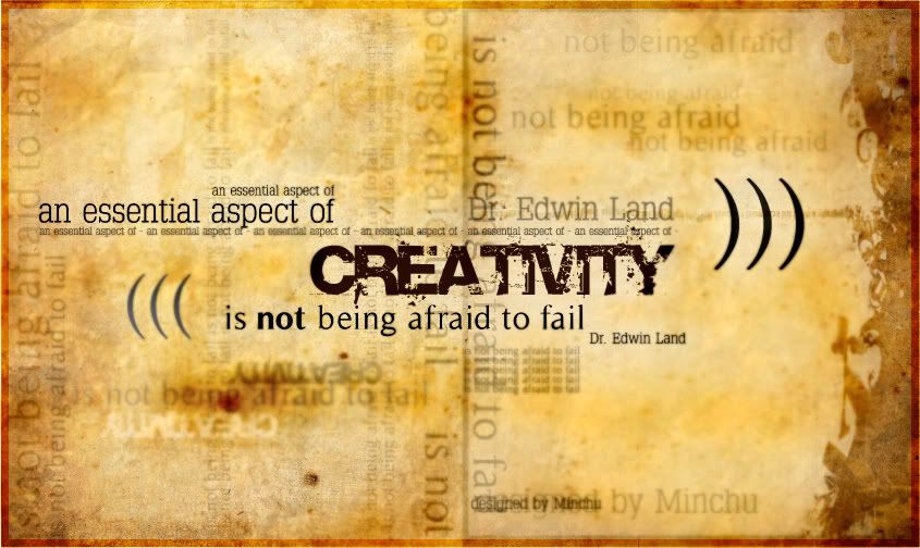
This is my official post for this week.
I design this just for layout practice. Because the article is about rock, so I want to make it strongly, firely and wildly. That why the color is really hot, typeface is destroyed and heavy and brush is quite messy.
Working procedure:
1. Fill the background with pure red. Then blend it with some yellow brushes, white brushes to make the "heat" (you can see from the middle to the top of the layout).
2. Place other elements in and change mode + opacity to make they look fit with the background behind.
3. Place the main text in. I make the border outsite the text in order to make it a little bit seperate from the background and image elements.
4. I place the typeface for the header in. I try to make a contrast between the Rock, Roll and the others in order to make them stand out and catch viewers eyes. Beside, they may add more "heat" to the poster because they are all destroyed fonts.
This is my entry for this week. Please feel free to comment. Thx :)
Minchu


