Monday 12 May 2008

Giaolongpte Webpage

giaolongpteSmall


Please click here to see larger size
This is a design for my family company, a printing service. I designed the interface quite simple because the webpage has not too much information. Besides, target customer is everyone. The banner is quite 'empty' but it will include flash in the future.

Sunday 20 April 2008

Banner for Simu Market event

Photobucket

This is the official post for this week. Please click here to see a larger size version of this piece.

This is a banner I designed for a coming event of business club, RMIT university. This event is named "simu market" - there are 6 Business Club teams which will undergo a simulated business process and compete together on a real-life basis.

In this piece, I just concentrated on typography and didn't care much about the image.

Working procedure:

_ I found a nice picture on the Internet which looked quite "market" - the term related to my subject. Thus, I chose it as a main background image.

_ I used font Arial and played around with kerning. I tried to make a contrast between them, the text.

_ I used the term 'closure' in order to make my typography more attrative.

Please leave comment here. Thx.

Monday 14 April 2008

Poster for training series skill

Photobucket


Main post this week.
Click here to see larger size

This is a poster I design for Business club. The club is going to hold an event named Training series.

Working proceduce
_ I find a very nice coffee cup on the Internet.
_ I play with blending options in order to create light effect.
_ Blending mode (esp. Color Dodge) to make the light more magic.
_ Brushes are use to make the steam.
_ I type the text and then Filter > Distort > Wave.

Sunday 6 April 2008

Web interface

Photobucket

This is my official post for this week.

Click here to see larger size

It took me ...hours to finish. :P

Working procedure:

This website is about real estate so I tend to use brown color, the color of earth. The background I blended with a sandy image, so as can be seen , it's rough and maybe, look more realistic.

Every element in this piece, I used square/rectangle shapes to make people think about "architecture". Simplicity is the term I tended to use because I think that my client's clients are people who are not interested in 'colorfulness'. However, to make it look more attractive, I used a lot of shadows.... So, I have nothing to explain more. This is my post for this week. Thx you for enjoying. Feel free to leave comment here.


Saturday 29 March 2008

Rock magazine

Photobucket

This is my official post for this week.

I design this just for layout practice. Because the article is about rock, so I want to make it strongly, firely and wildly. That why the color is really hot, typeface is destroyed and heavy and brush is quite messy.

Working procedure:
1. Fill the background with pure red. Then blend it with some yellow brushes, white brushes to make the "heat" (you can see from the middle to the top of the layout).
2. Place other elements in and change mode + opacity to make they look fit with the background behind.
3. Place the main text in. I make the border outsite the text in order to make it a little bit seperate from the background and image elements.
4. I place the typeface for the header in. I try to make a contrast between the Rock, Roll and the others in order to make them stand out and catch viewers eyes. Beside, they may add more "heat" to the poster because they are all destroyed fonts.

This is my entry for this week. Please feel free to comment. Thx :)
Minchu

Monday 24 March 2008

Blending exercise

Photobucket


This is NOT an official post for this week. This is just an exercise in class in order to practice blending technique. Thx for enjoying. Feel free to leave comment here. :)

Minchu

Thursday 20 March 2008

[Typography] Quote "Creativity is ...." - Dr. Edwin Land

quote - creative design - small

This is my official post for this week. I highly recommend that you should see it in a larger size at this link: http://i234.photobucket.com/albums/ee9/Achilliesin/quote-creativedesign-large.jpg

Note:Every week I will post an artwork which does not repeat the subjects of previous weeks. If it does, I will mark it "NOT official post".

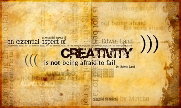
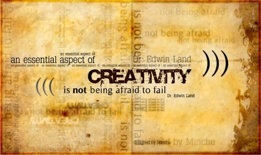
This week I try to play a little bit with Typography. In this design, I use type to create theme and variation. However, this term is quite difficult to deal with and I actually have not enough skills + knowledge to make it look professional. So, I use haft unity, haft variety in this. :P

Working procedure:
I use Illustrator for this design.
_ I have a paper texture in my library, so I just use it.
_ I arrange the main text first: "an essential aspect of Creativity is not being afraid to fail". Then, make the 'focal point' of the whole artwork. As you can see, it's "Creativity". This may be called "unity".
_ However, after the second step, the artwork seems to be quite empty. So, I make a lot of text with various opacities to make a "theme" which supports the main text. This may be called "variety".
_ I export it as a JPEG file and then fix the color in photoshop. In fact, I make it more rough and dirty in order to show the "classical look".
_ Lastly, I save as two version: small one to post in this blog. Larger one to see clearer.

Please leave comments. I would love to hear your critical thinking. Thanks. :)